More than a Symbol: How logos build trust, identity, and brand power.
The Strength of a Logo
There was an insightful study that asked 100 people to draw popular logos from memory. The results were (obviously) entertaining: even with logos people see every day, many of the drawings had incorrect colors, missing text, or misplaced symbols. This experiment underscores a powerful truth: recognition isn’t just about visibility—it’s about trust, simplicity, and emotional connection.
The logos that stick with us are more than just visuals. They represent something we believe in. They’re simple, trustworthy, emotionally resonant, and encapsulate a brand’s personality. And yes, you know when you see a McDonalds, Spotify, or Starbucks logo you have an emotional response to their identity. As one article perfectly put it, "A logo is not just a symbol—it’s a vital representation of a company's identity and values."
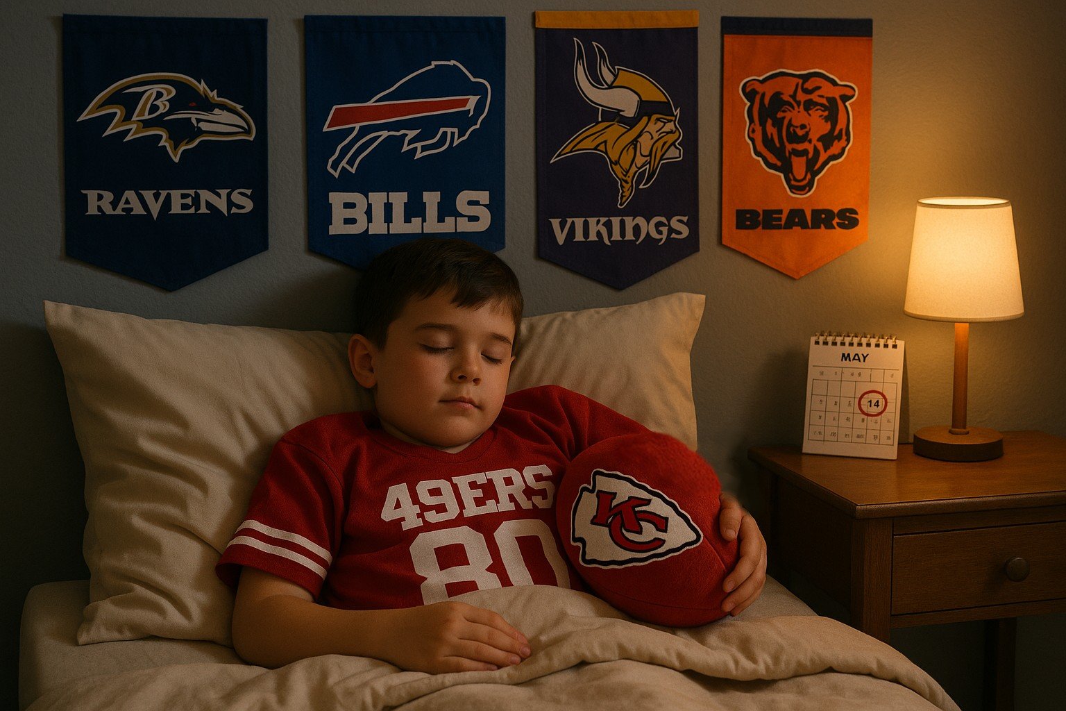
Being in the ticketing industry, it’s only natural to look at sports for examples of iconic logos and enduring brands. Think of the Dallas Cowboys, New York Yankees, Chicago Cubs, or [insert your favorite team here]. Whether you’re a die-hard fan or not, chances are you could recognize or even sketch those logos.
Why? Because those logos are more than emblems. They symbolize decades of history, loyalty, community involvement, and emotional investment. These teams didn’t become iconic overnight. They earned trust, showed up consistently, built deep connections with their fans, and marketed themselves as more than sports franchises—they became a part of people's identities.
That’s the kind of branding magic every company should aim for, but what about brands that aren’t household names—yet? For companies trying to make their mark, it takes more than a good product or clever ads. It takes dedication to building real trust, creating a consistent identity, and being intentional about how you're perceived.
You can’t just assume people will remember your name or understand your value from the jump. You have to show them, prove to them, and earn that recognition. That starts with an identity—logo included—that is clear, consistent, and honest.
At SuiteHop, this philosophy hits home.
We believe premium tickets are more than just access to an event—they’re your gateway to a luxurious, unforgettable experience. That belief shaped everything about our brand, especially our logo.
We designed the SuiteHop logo to reflect our core values: a modern, no-nonsense approach to premium ticketing, a touch of fun, and a promise of simplicity. Our identity is rooted in making luxury accessible, stress-free, and memorable.
We’ve built our business around delivering real value with a personal touch. Here’s what sets us apart:
- Personalized service with a human connection: You’ll talk to a real person who knows the industry and is here to help. We're accessible via phone, text, and email. You’re never alone in the process.
- No hidden fees: Transparency is key—we keep our pricing straightforward and honest.
- Straightforward pricing: What you see is what you get. No surprises.
- Clear deliverables: From tickets to catering to parking—we tell you exactly what’s included.
And it’s all reflected in our name—SuiteHop. We’ve even turned it into a verb.
The “SuiteHop” is our modern, luxury approach to the ticket industry. The "hop" reflects the action of jumping from suite to suite, city to city, event to event, all made seamless through our platform. And the dot in our logo? That’s not just a stylistic choice. It symbolizes your single point of contact—a real individual ready to guide you, answer your questions, and help you plan the perfect experience.
Just like a great logo, a great brand doesn't just say what you do-it shows you who you are. So SuiteHop into your next event, and it will be more than the game or concert that makes it unforgettable.